Will do. The old website redirect was set in JS  and we missed that bit when the content was updated. Now it will be set properly
2 Likes
Yeah finally! ![]() Because the doc hub was affected as well hehe:) Over here (or at the doc hub itself) you can have a look to another new updates and a lot of additions to the JS SDK: https://github.com/aeternity/documentation-hub/commit/cd828a0bcf02239b8eb0048cf8c6b6c3ff65c992
Because the doc hub was affected as well hehe:) Over here (or at the doc hub itself) you can have a look to another new updates and a lot of additions to the JS SDK: https://github.com/aeternity/documentation-hub/commit/cd828a0bcf02239b8eb0048cf8c6b6c3ff65c992 ![]()
P.S.: Another little feedback regarding to the website:
-
Are Terms & Conditions, Privacy Policy and Copyright Statement completely missing currently?
-
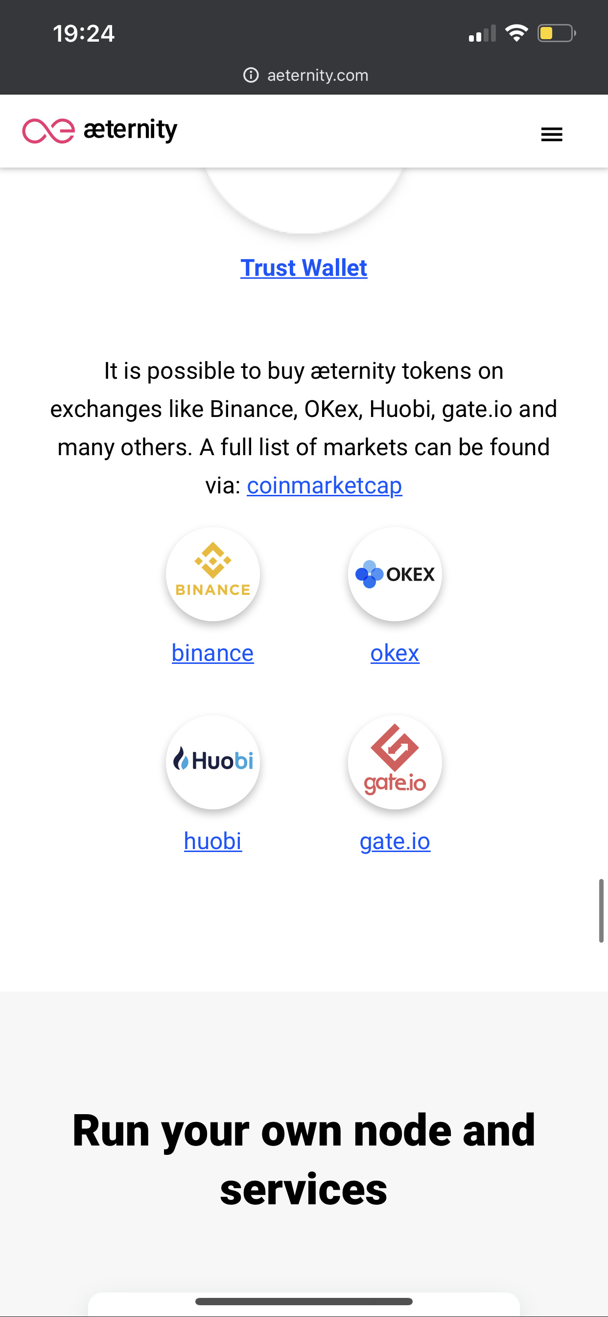
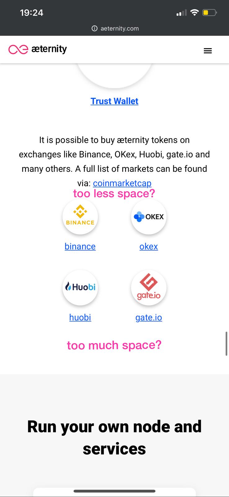
(on mobile regarding to space and positioning of the icons)
1 Like
They are in process
HTTPS Enforcement has been enabled.
6 Likes
what’s in my opinion a bit confusing on the website when surfing on desktop:
- there is no information that the user can/should scroll down to see further informations
- the menu only contains links that open other pages
I am not a UI expert. but for me it feels like the user never gets the (important) information about aeternity if he doesn’t actively scroll down to see more.
2 Likes
Some more anonymous feedback :
"kind of regress I think. I don’t like the new cosmic code background picture, but this is subjective. I would say page less modern even if information is consistent and everything what needed can be found there. But this is the thing which must be fixed pls: https://aeternity.com/assets/img/What_is_Sophia_Graphic.3226810a.svg?fbclid=IwAR1SJltc-BgZZEleA5m-EuxzkoMvz_03kSezVfn5Y9u9cvpko72l8zBRTH0 "
The external links are removed so the users are not confused.
Although I agree that scrolling (length) is a bit too much as for now (would be revised in the near future), yet I don’t think that missing indicator (that you should scroll) is an issue. Users of the site are supposed to be technically educated and I bet they are. I don’t think they need a clue for such a fundamental thing, furthermore there is a scroll bar visible.
Related to these, though there is an idea of some ToC navigation/indicator (that follows scroll) to be implemented, although it would be a challenge to fit it on a mobile screen (where it would be most useful).
@erik.chain Image is updated to the new Sophia syntax
1 Like
One more anonymous remark:
“Pls let sb take a look also on this laptop picture edges. It’s svg file but still the pixel effect is really visible”
An extensive feedback we received on Reddit:
Good improvement team! Design-wise it could be nicer, but it is acceptable. In terms of information, it is a big improvement over the previous site. It really highlights all the selling points of the platform, in a very clear and complete manner.
Some feedback:
- I was missing a link to https://www.aepps.com/ ? Shouldn’t it be there? Or did I miss it?
- Also, the Paradigm fund blog mentioned that aeternity.com will also link to the most important websites and projects across the ecosystem such as: aeventures.io, aeternitystarfleet.com, aeternity-foundation.org, aeternityconsulting.com. I’m looking forward to seeing those featured on the site as well! Should probably be its own section on the page.
- In fact, you have so many websites that are part of Aeternity ecosystem, I would recommend replacing the “Forum” hyperlink at the top right with an “Aecosystem” dropdown menu. Clicking it or mousing over it would expand a menu with ALL the links to all your websites, including the forum and the aepps site. This change does not mean you don’t need to add an Aecosystem section. I think you should add both.
- Every site of Aeternity should have the dropdown menu mentioned in the previous point, so that it is easy to quickly jump between sites.
- My personal preference is to make every site of Aeternity a subdomain of aeternity.com. For example, aepps.aeternity.com. I believe now only the forum and the blog follow such a structure. Maybe it makes more sense to make it consistent. The benefit of using sub-domains is that it is clear that these products are managed/owned by Aeternity. By using separate domains, this is not immediately clear. Consistency also allows to find these sites by simply typing an URL, without having to guess whether it will be a sub-domain or a separate .com domain site.
- The forum seems important. That’s why I would go further than to just link to it. I would also put a widget on the site that somehow shows the latest forum posts (clickable), or perhaps the most popular posts from last week/month. This would give the forum more importance, and it would feel more accessible from the main website.
- Regarding the previous point, I would do the same with the blog. You always have good blog posts, but they are under-exposed. Add a site widget to show the latest blog posts imo. Also, any new blog post should be sent to the mailing list (see point 9).
- The “Get involved” button at the top should be thought through better. Right now, it is very unclear what clicking it would do. I had no idea it would take me to the forum. Usually, such a header button scrolls down to another part of the same page, so seeing a pop-up appear felt quite intrusive. If you want to make the forum more prominent/accessible, there are better ways to do it (see point 6 for example).
- I don’t recall ever seeing an Aeternity email from your mailing list. If you have a mailing list, I would be utilizing it. Send a monthly email update on Aeternity improvements or whatever.
- I mentioned before that design-wise could be better. Especially the top section is bothering me. The pink with the purple is a bit too much for my eyes to take. Both colors are compatible, but not when used in abundance as full background colors, like they are at the top. To solve this problem, I suggest to desaturate the purple background. Make it black or dark grey (still keep the graphical elements such as the man and the code). However, that might break consistency of your design guide, not sure.
- Related to the previous point: I personally think your brand colors aren’t the smartest pick, they look a bit cheap. It’s not something I would give to a product that needs to look trustworthy, such as a blockchain platform. This is why you’ll never see a bank use such brand colors (it’s usually blue that is used to show trustwortiness – there is a lot of science behind choosing the right colors for your brand, depending on the type of product and your customers; I feel you guys haven’t researched it). But I don’t see you changing your brand colors at this stage.
5 Likes
I don’t like it. Developer first approach is wrong.
I think users first, and developers second.
Imagine the marketcap is 10x more, more developers will come because they will get 10x users and income. Developers will help to build most of the tools for other developers.
Imagine the marketcap is 10x less, who will develop on AE? Nobody.
3 Likes
Agree, no users will be adventurous
Lack of leaders, like jack ma of alibaba in China, he will lead the team to have the technology, the marketing, otherwise is neglected, a dead end
1 Like
Thank you for your feedback @xiahui135, the website will be improved further, stay tuned for news on that front.
Best,
Albena
Regarding to point 9 => https://aeternitynews.substack.com/ - a monthly newsletter about all updates happening inside of the whole æternity ecosystem! ![]()
Please subscribe to stay updated and to not miss any news! ![]()
2 Likes
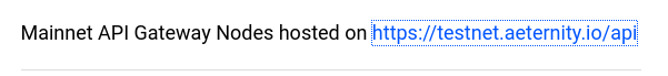
Found a minor bug. The underlying link is correct, but the text points to testnet
1 Like