So I will write this down now. It would be nicer to get this pre-made from POs or Designers as I need a list of exact requirements to actually build this. Here is how I would imagine the briefing to look like:
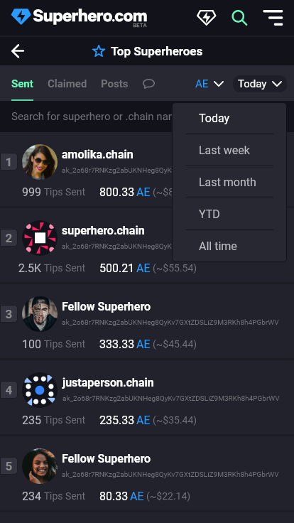
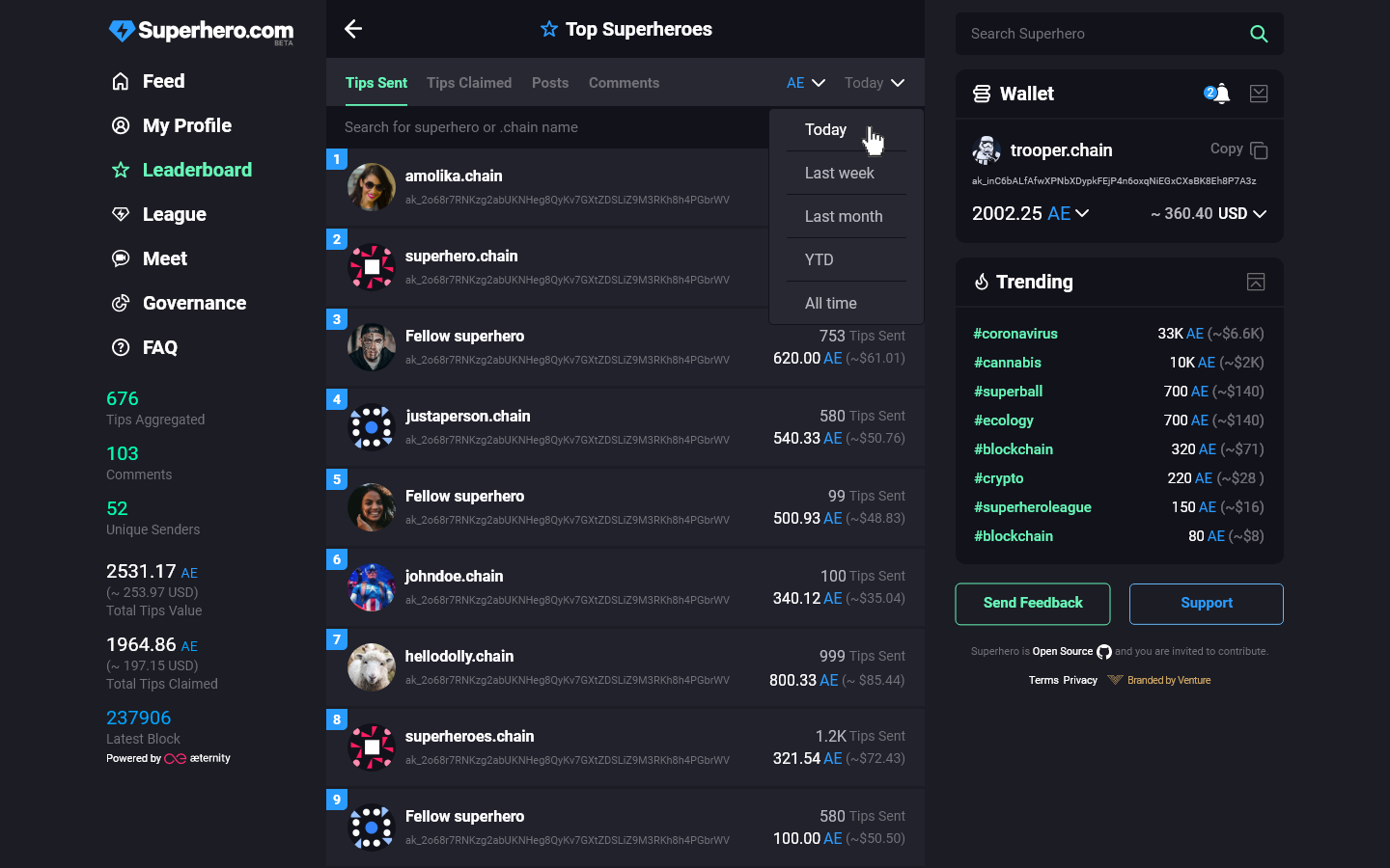
We will have a new page called “Leaderboard” with the title “Top Contributors”. It contains a ranked list of all accounts that can be ranked in the one of the following categories:
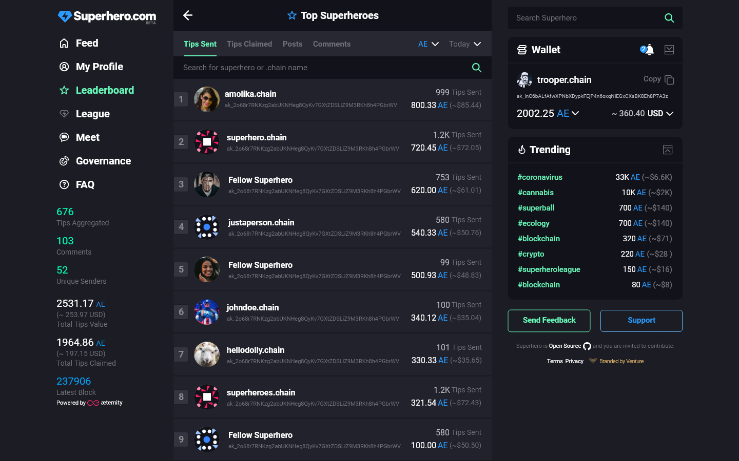
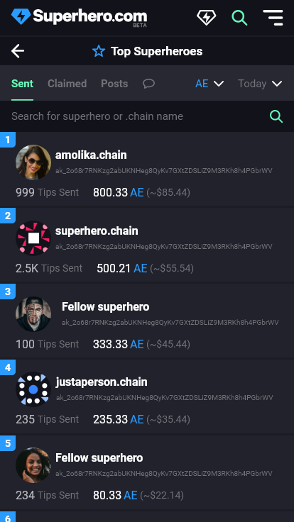
- Tips send --> ordered descending by the AMOUNT of tokens tipped
- show tip send amount & tip count
- Tips received --> ordered descending by the AMOUNT of tokens ?received?
- show tip received amount & ?
- Tips claimed --> ordered descending by the AMOUNT of tokens claimed
- show tip claimed amount & tip count
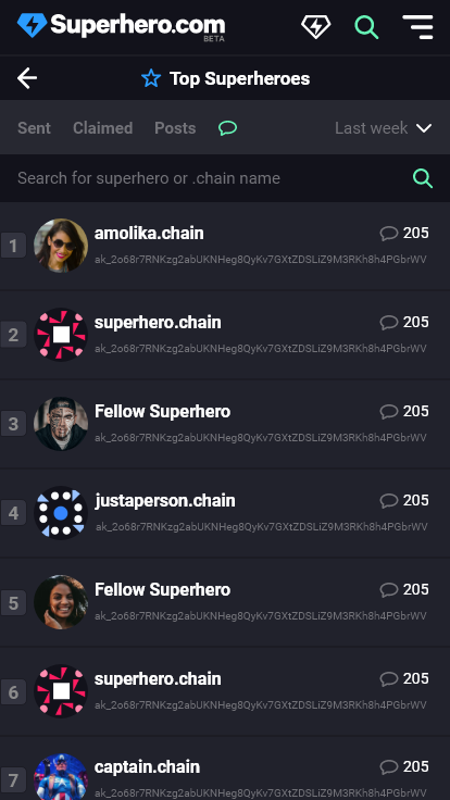
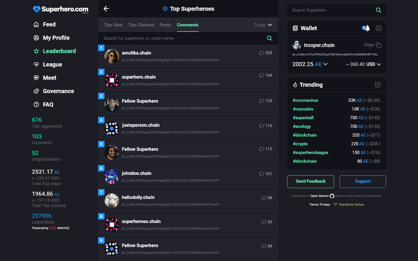
- Comments --> ordered descending by the number of comments authored
The list should be filterable by two dropdowns :
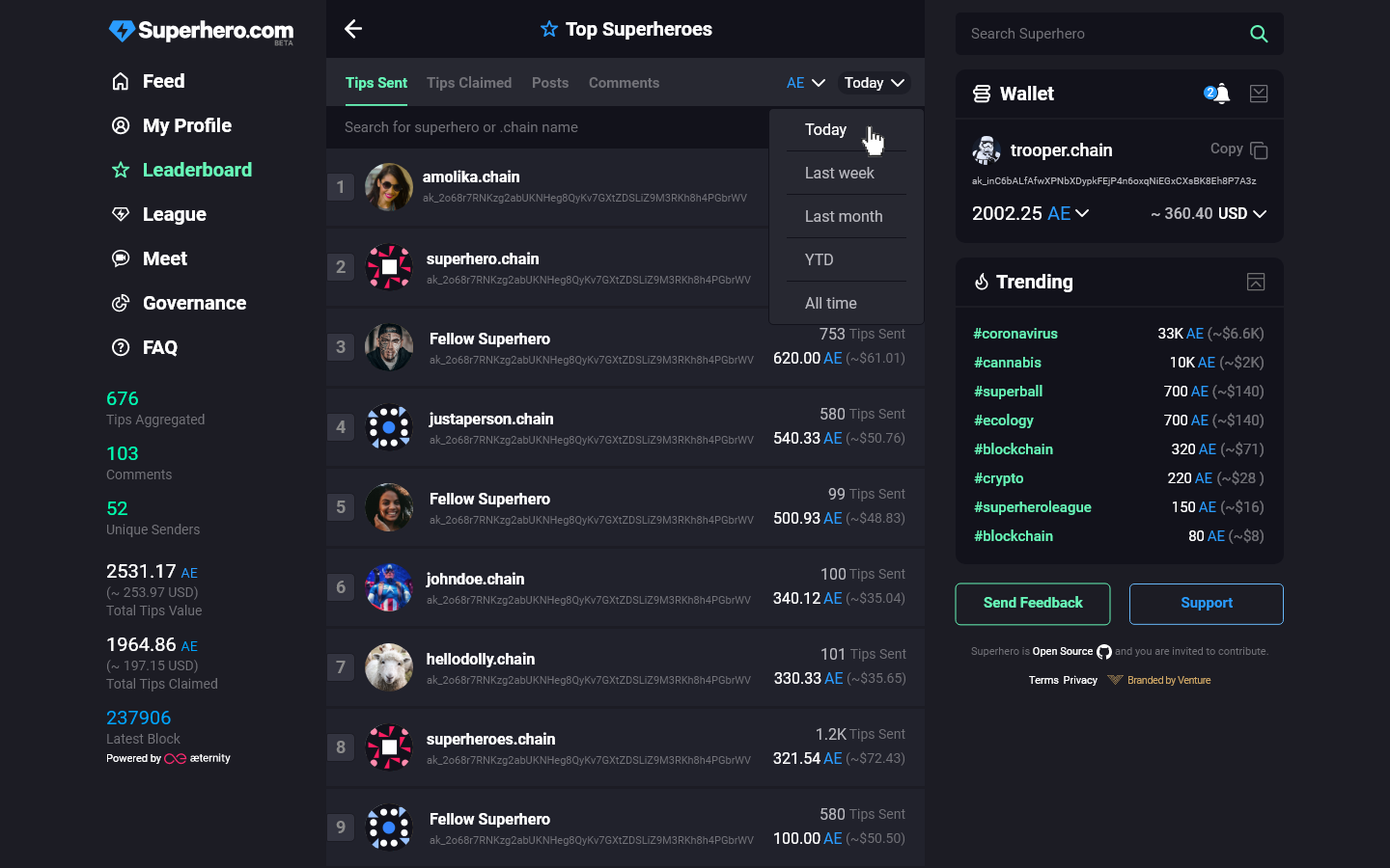
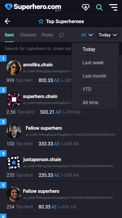
- Time
- Today --> 0:00 CE(S)T to now
- Last Week --> 0:00 CE(S)T from 7 days ago to now
- Last Month --> 0:00 CE(S)T from 30 days ago to now
- YTD --> 0:00 CE(S)T 1.jan till now
- All Time --> Full history, for 2020 now equal to YTD
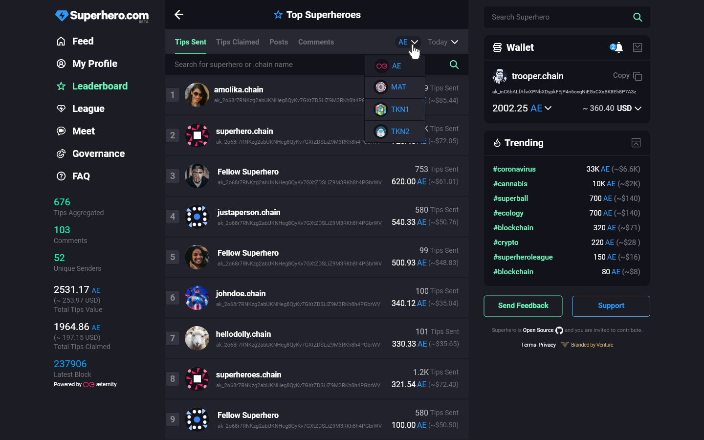
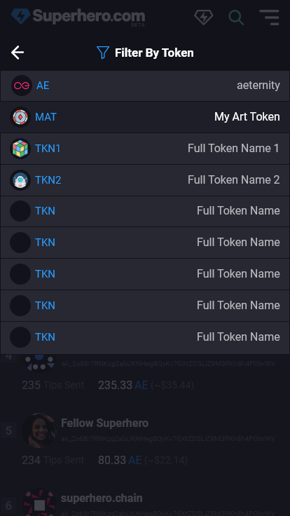
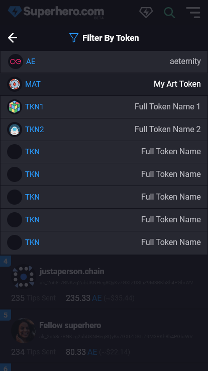
- Token (Out of scope for initial implementation)
- All tokens with compatible token contracts
Other important notes:
- The list should be updated as soon as any state is changed to encourage competitive behavior.
- Token implementation will be retrofitted later, otherwise this is blocked for some time
Open Questions:
- “Leaderboard” vs “Top Contributors”: Shouldn’t we find a consistent naming here?
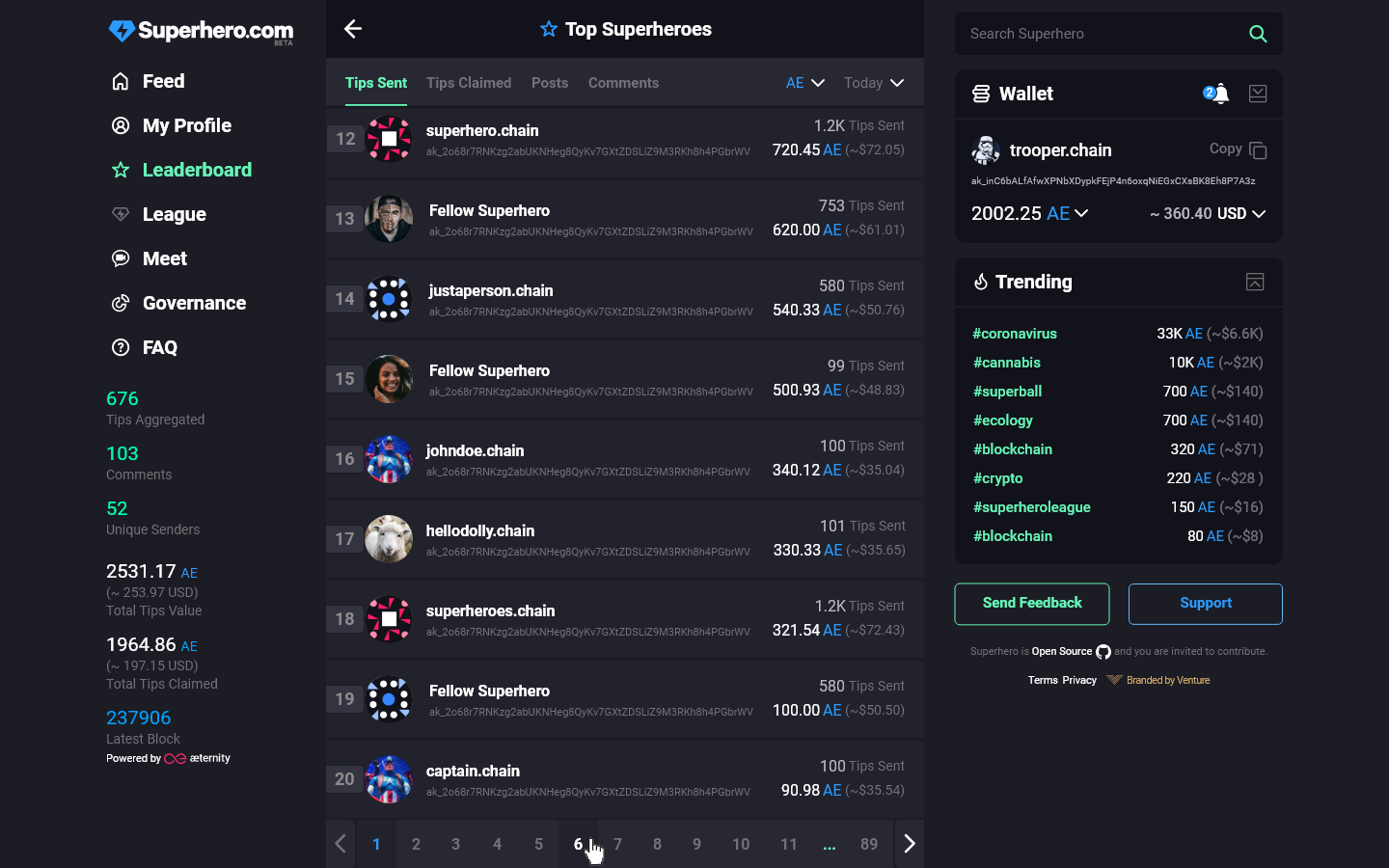
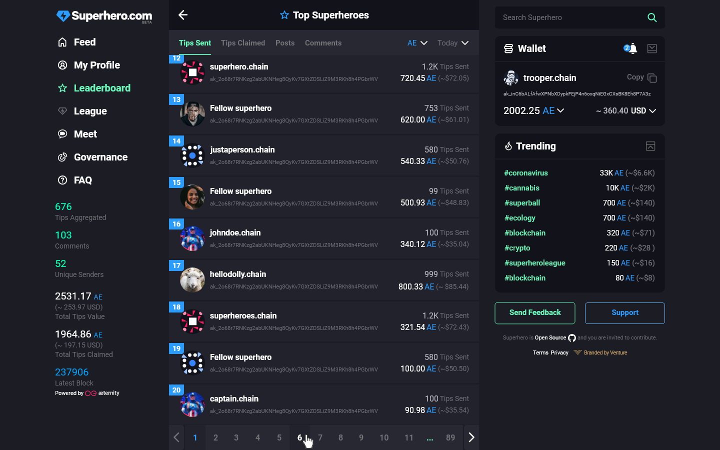
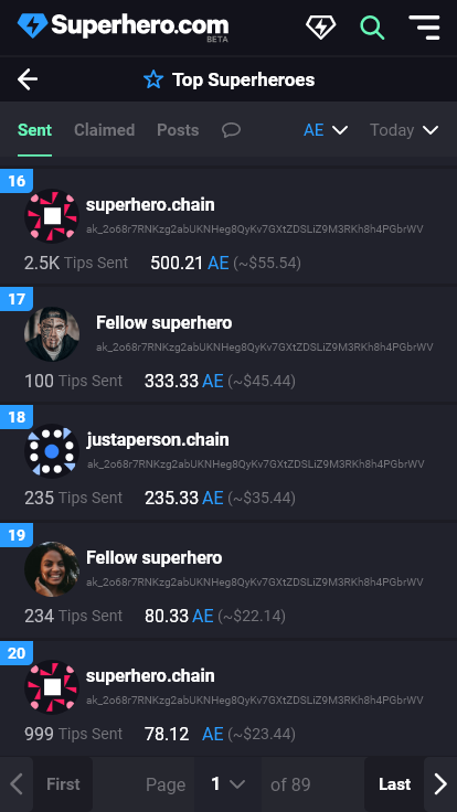
- Is there a limit to the list (eg. top 100 heros? or should the list be paginated and include everyone?)
- Whats the decision on “received” tokens and “claimed” tokens? I also vote to remove received tokens.
- When do we reset the times? today = Using CE(S)T as a reference to reset at 0:00? what about week & month?
4 Likes
@keno.chain Seems that you summarized everything right.
Answers to your questions:
-
Don’t implement the Title for now as I plan to suggest a new navigation design solving some issues we will soon have with the growing list of left menu items. Probably I’ll utilize the space to the right of the back arrow. Let’s leave “Leaderboard” in the left menu for now.
-
What are the possible issues with having more than 100 (from tech perspective)? From UI perspective - we don’t need numbered pagination but infinite scroll as for the feed items display. With our current users displaying top 100 is OK but with a growing users number I’d suggest displaying top 500. It will depend on the total number of users.
-
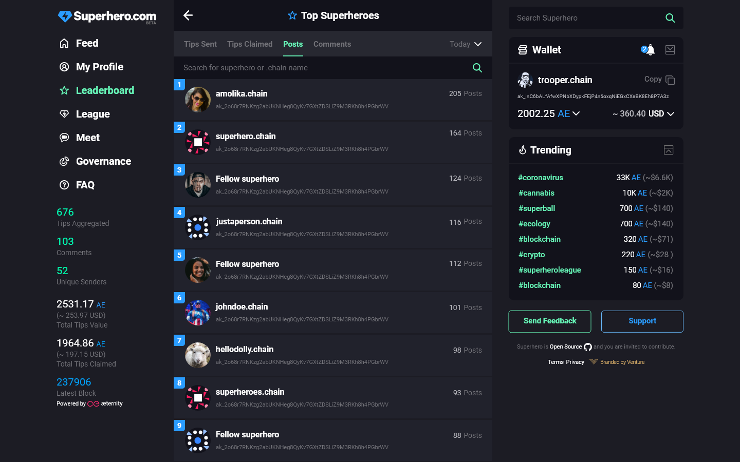
My personal opinion is to leave only Tips Claimed and remove TIps Received. Thus we’ll have space to add later (when Posts are implemented) filtering by number of Posts (without tips). At the same time the user who claims the tips received is the one who contributes more to the platform and not the user that has never claimed a single tip (but might have received more tips). @bruteforce.chain @sergiimaksiuta.chain what do you think here?
-
Last week - the last seven days (Friday, 11.09.2020, 15:00 CEST - Friday, 4.09.2020, 15:00 CEST). The same for Last Month filter.
=== === === === === ===
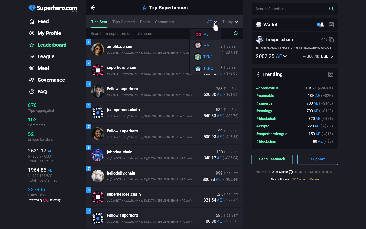
IMPORTANT: Filtering by token is the only possible option I see. I mean that all other filters should work in combination with this one. At the moment we have only AE but if we have tips with other tokens in the near future (which will be the case) we won’t be able to compare and order in a meaningful way the users if we don’t have the token filter.
For example: who should be ranked higher:
User A: Sent 150 AE, 200,000 TKN-X
User B: Sent 200 AE, 100 TKN-Y, 100,000 TKN-Z ?
(so user chart needs token filter anyway to work in combination with all the rest)
Looks good, thanks for the clarifications.
- Its not a problem to have an infinite scroll, so 100 or 500 or 500000 does not really make a difference.
- Lets do it then.
- shouldn’t we rename the option then? but I guess we can discuss this later in the process.
I agree with your state on tokens. There is no way to compare them so we must create independent leader boards for each token which would be accessible by the provided filter.
2 Likes
Agree with the discussion above.
Let’s try giving more info on features from now on and their desired functionality as @keno.chain already suggested - its easier to specify, plan, and implement both from the development and design side.
My opinion here on point 2 is that it will be better with pagination and the search bar working for this to be able to find quickly someone and their position on the list.
Eg. As a user If I’m not in the top 20000 heroes, I’d like to be able to find myself using the search box and see on which page/position I’m at instead of scrolling indefinitely until i reach my position in the list.
2 Likes
Agree. But…
-
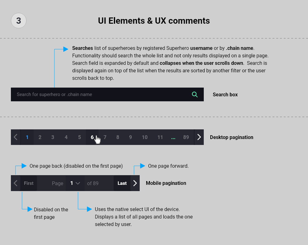
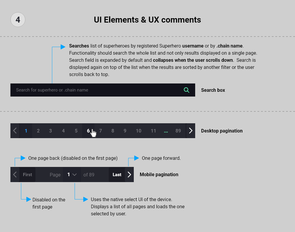
About the search: One option is to add search functionality within the Leaderboard page (I’ll have to design it and update the mockups but I already have an idea). OR another option is that we have contextual search for the Superhero search box according to the page user is at. This will require change of the search label so if the user is at Leaderboard page “Search Superhero.com” will become “Search Top Superheroes”.
-
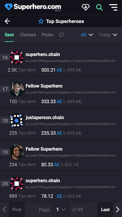
About the Pagination: UPDATED After thinking it twice I think @milenradkov.chain has good point about the pagination. If we display more than 100 heroes it will be good to have pagination otherwise it will be difficult to the user to scroll to (let’s say for example) #500 position in the chart. SO either we display only top 100-150 heroes OR we add pagination so the user can navigate the list more easily.
The infinite scroll has one obvious UX problem: when the user has scrolled down long way it is hard to go back to top directly. Anyway this is still valid for the feed. So better solution here is to provide some UI for “back to top”.
2 Likes
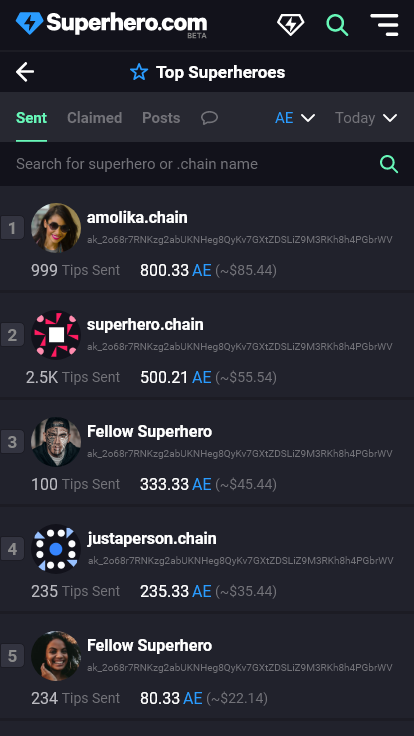
Updated design according to changes and improvements suggested in the discussion above.
- search box added;
- pagination added (desktop and mobile);
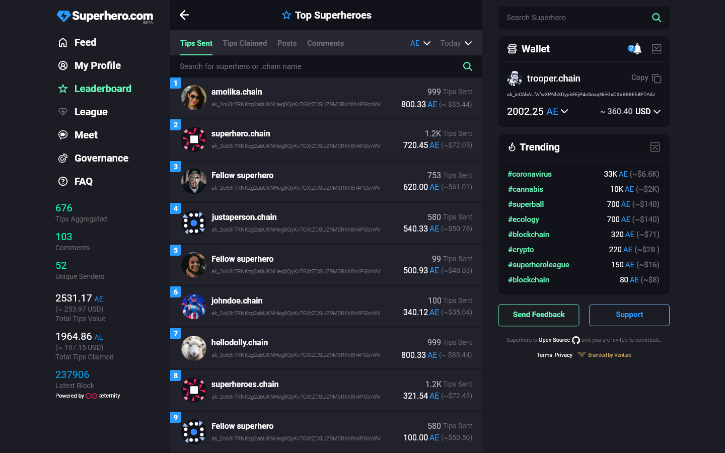
- filter Received tips replaced by Posts (although the functionality is still not implemented).
Direct link: https://nx3594.your-storageshare.de/apps/files/?dir=/P1/Superhero/Superhero.com/Desktop/v2/Leaderboard&fileid=452022
Directory: …/P1/Superhero/Superhero.com/Desktop/v2/Leaderboard/
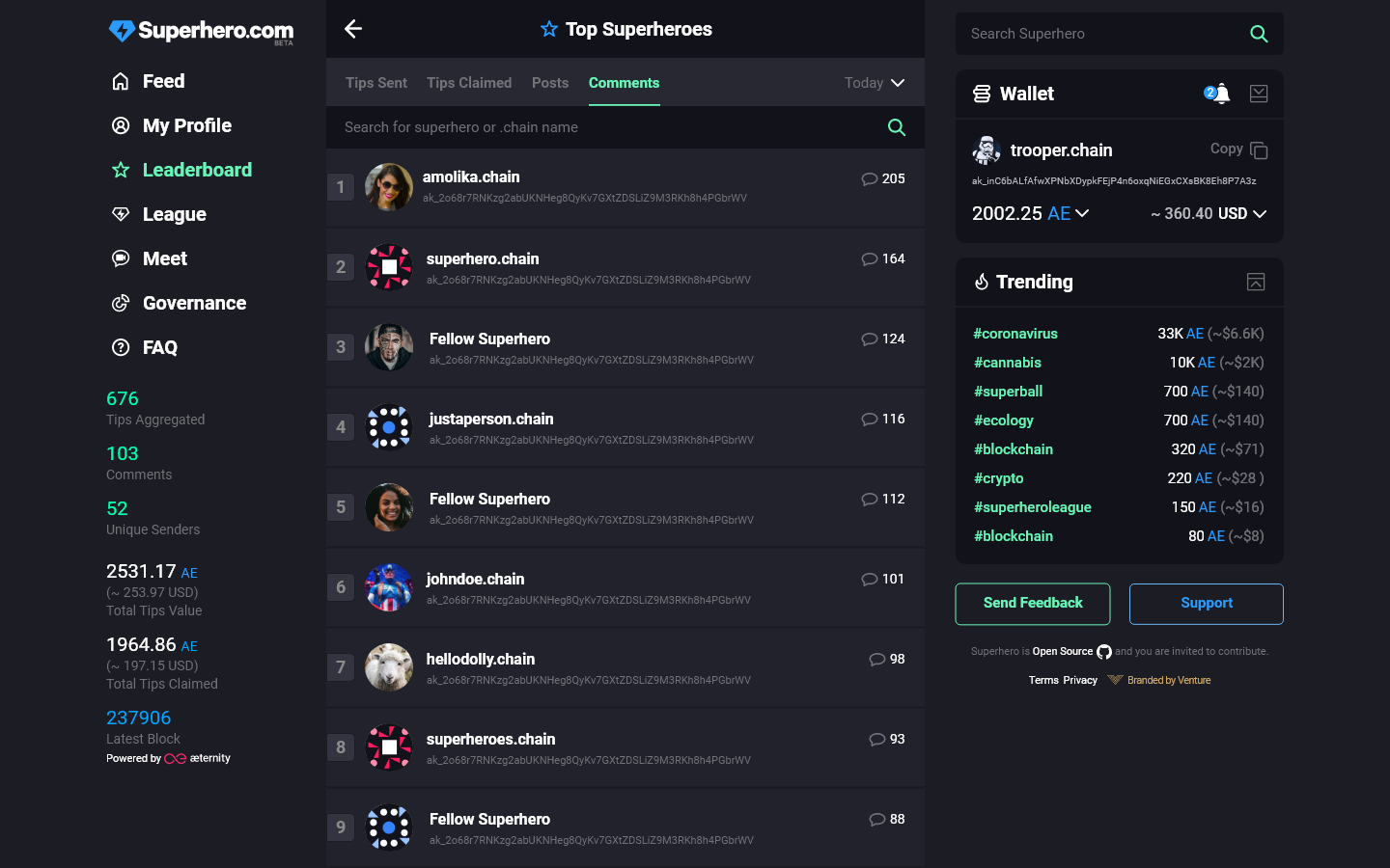
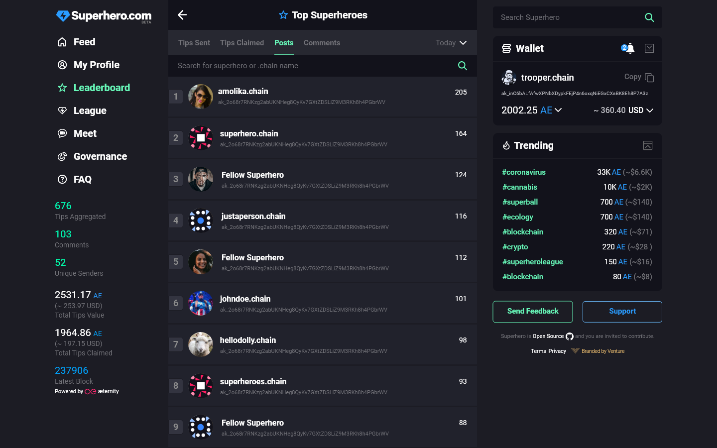
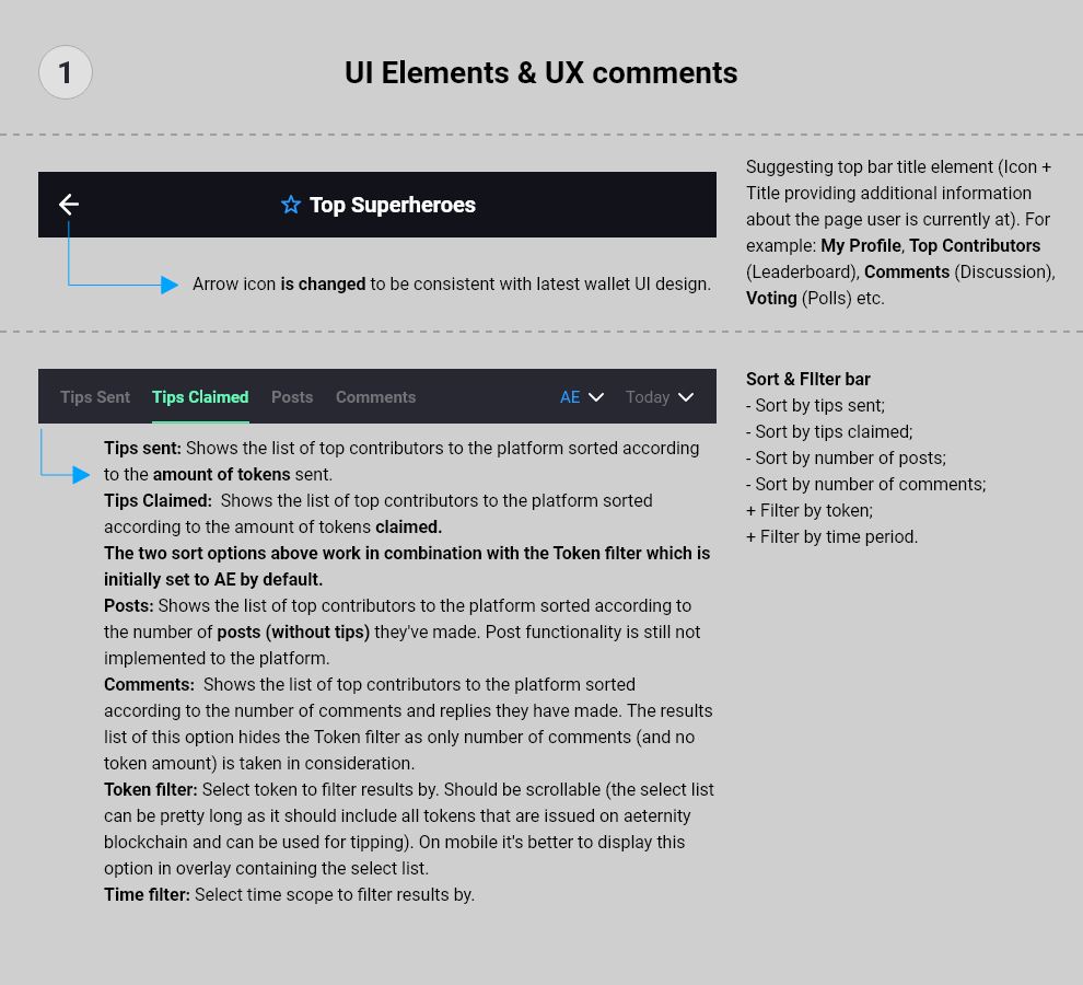
Latest design update and description of the functionality:
Desktop:
Mobile:
Functionality:
Regarding the date filter and tokens see the discussion with @bruteforce.chain and @keno.chain (in the previous forum posts).
2 Likes
As discussed I applied few minor changes to the design:
-
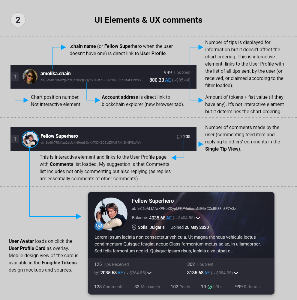
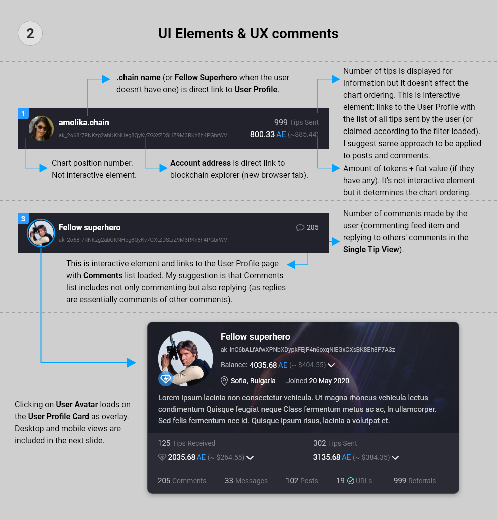
Changed number display element for UX reasons (with long numbers it would have covered too much area of the user avatar). Now even with numbers above 100,000 the avatar is still visible and accessible (the number display tag will cover only its top in this case).
-
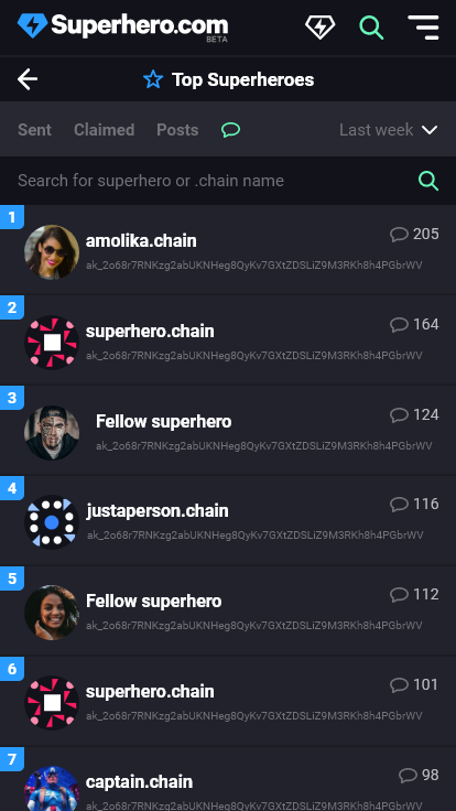
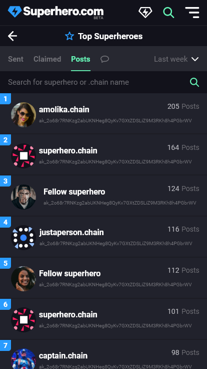
Added mobile view design for Posts filter.
-
Changed a bit positioning and colors of elements within a single item (avatar, blockchain address, number of comments, number of posts). Chanages are minor (and don’t change the whole layout) and for consistency reasons.
-
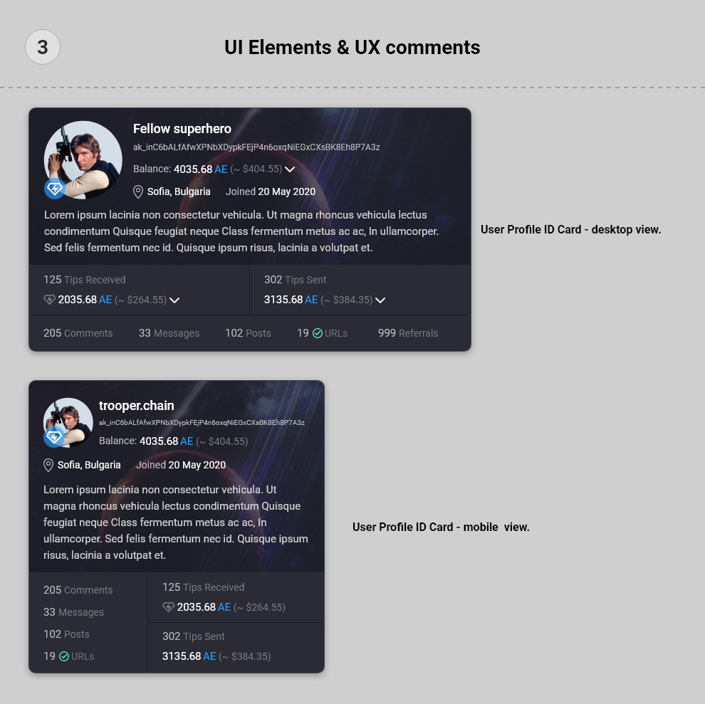
Added mobile view of the User profile ID card (which is displayed on mouse click over the avatar).
The directory on Nextcloud is renamed from “Leaderboard” to “Heroes List” as we discussed that this is the correct naming of the feature. This raises the question of changing the wording in the left menu too. However this is not dsign-related issue and can be discussed later. To me both sound good but may be I prefer “Heroes List”.
Direct Link: https://nx3594.your-storageshare.de/apps/files/?dir=/P1/Superhero/Superhero.com/Desktop/v2/Heroes%20List&fileid=452022
Directory: …/P1/Superhero/Superhero.com/Desktop/v2/Heroes List/
Updated detailed designs:
Desktop:
Mobile:
Elements and Comments:
@bruteforce.chain , @sergiimaksiuta.chain , can you update the developer who is working on this please.
1 Like